Axis Southeast
A conceptual redesign of a Southeast Asian venture capital firm website focused on clarity, credibility, and conversion.

Overview
I wanted to look through websites in my country that seemed outdated or just weren't relaying the message they intend to as powerful as they can, hoping to find one I would find fun redesigning. After a while, I found Kickstart Ventures and skimmed through their site.
"Kickstart Ventures is the Philippines' most active Corporate VC fund for Pre-A to Series C digital startups. A wholly-owned Globe Telecom subsidiary, Kickstart puts company resources - capital, market access & expertise - behind startups so they achieve scale and profitability sooner."
Issue (?)
The original website was clean, however it underutilized its potential to:
Communicate its investment focus at a glance
Build trust through visible credibility signals right away
The site had a lot of pages, and I honestly think they could've taken single pages that they made and placed it on their homepage, such as their investment focus, funds, and portfolio.
Goals
My goals for this project were to:
Clearly articulate who or what the firm invests in (industries, geographic indicators, etc.)
Establish trust literally within the first scroll, the first glance even
Maintain a clean aesthetic throughout the webpage
Improve conversion by laying out the website in a story-telling context
For my own personal growth, I hope to:
Improve my skills regarding visual hierarchy
Be more comfortable with creating custom or complex components in Framer
Integrate my intermediate programming background into creating custom components, with and without the help of Workshop
Research & Analysis
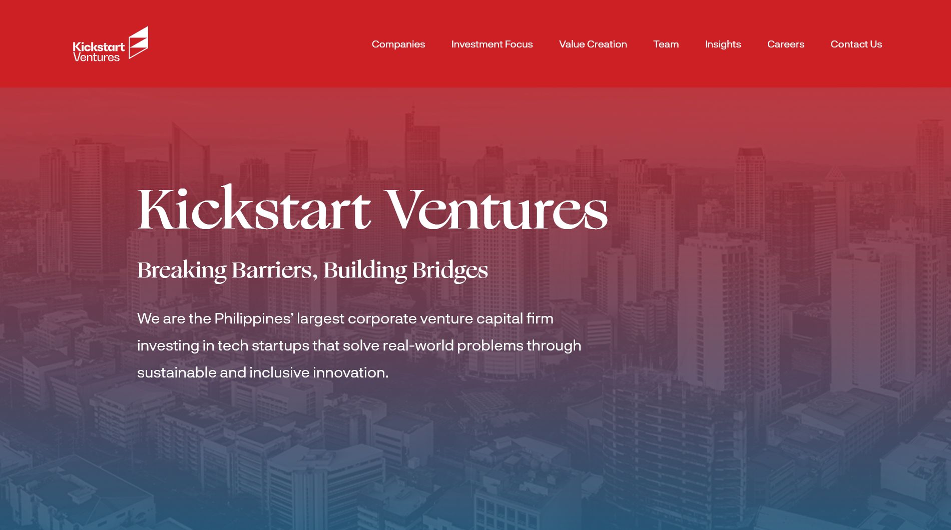
The homepage of Kickstart Ventures.
Audit
An analysis of the original site revealed:
Thin homepage content
Lack of scannable sections
No clear primary CTA (both buttons on the homepage redirect to their page dedicated to their investment focus)
Minimal trust indicators
Review
I looked up websites of other Venture Capitals, however I did not focus on VCs that are specifically at Southeast Asia, which could be an oversight.
I took note of two websites, and liked them for their visuals, and layout:
BlueBrown by Huy Ng
RRE Ventures by —
Takeaway:
High-performing VC sites balance minimalism with structured storytelling.
The Strategy
Instead of expanding into multiple short-content pages, I tried redesign the website by doing the opposite: keeping the page count as low as possible. This redesign consolidates key information into a single, scroll-driven narrative of the firm:
Who they are
What they invest in
Their portfolio
How they partner
Why founders should trust them
I treated founders as the primary audience, with secondary support for:
Corporate partners
Co-investors
Talents
Information Architecture
Sections
Hero
Track Record
Investment Focus
Portfolio
Funds
Partnerships (CTA)
Visual Design
Design Principles
Confident typography
Minimal color palette
Kickstart had two colors: red and light blue, however I decided to embrace the full red
Typography & Spacing
Large headlines for positioning
Clear spacing to guide user's scroll rhythm
Final Outcome
IMPORTANT NOTE: I left out a LOT more from the original website, such as their Value Creation programs and Insights, however I think this is enough for me to learn how to lay out a website properly—will definitely improve more though!

Hero section redesign.

Pretty cool fund interaction


